


Areas of Expertise
Art Direction
Branding
Packaging
Web Design
About
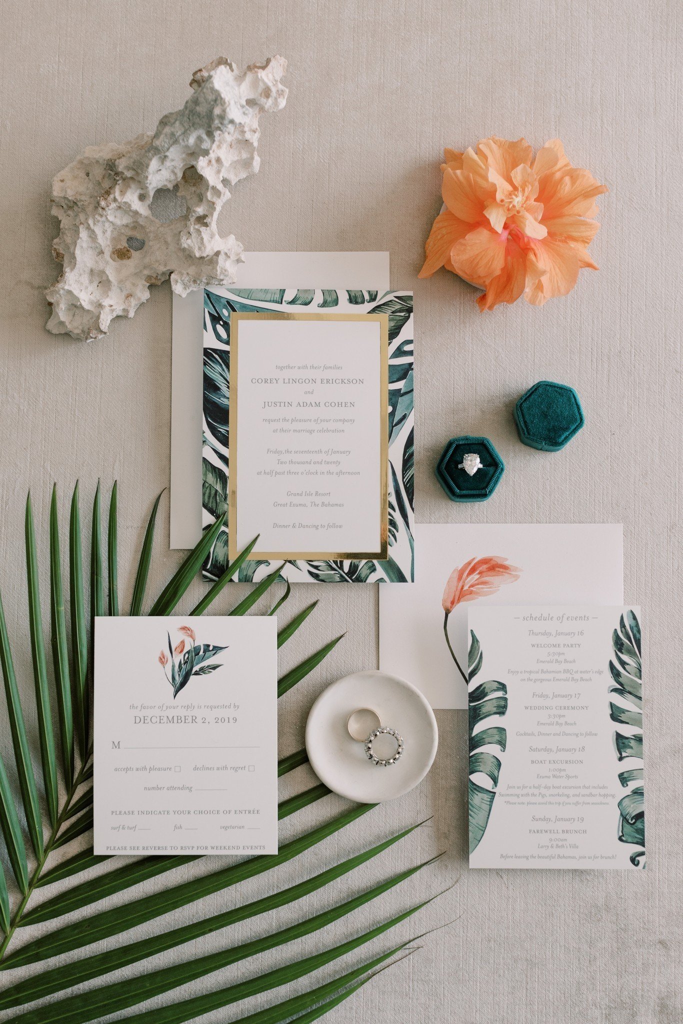
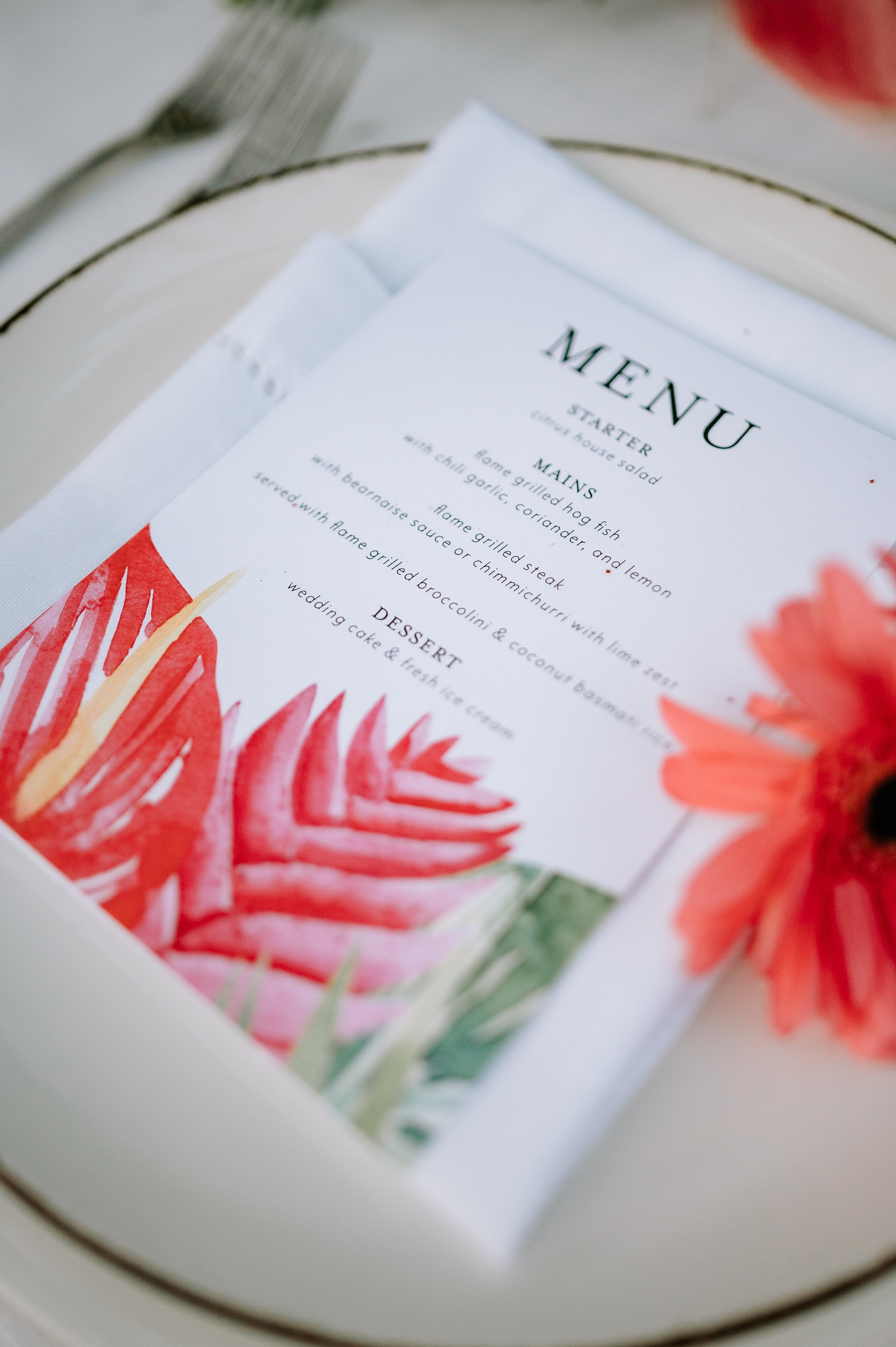
Since launching Kelly Ashworth Design in 2004, Kelly has worked with engaged couples to design bespoke wedding invitations and stationery suites.
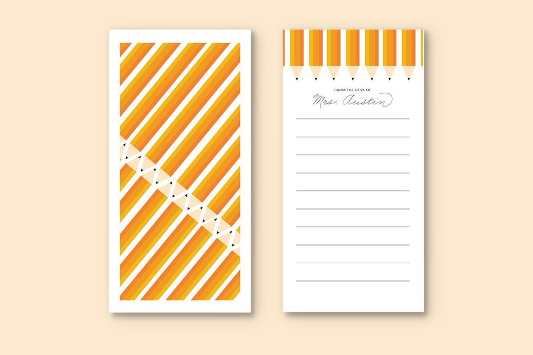
In addition to her work with consumers, Kelly also works with creative businesses to develop their brand identity, which includes logo design, website design, and marketing collateral.
Her client roster includes Coca-Cola, Mazda, La-Z-Boy, Coldstone Creamery, Katie Couric, Myka Meier, Matthew Miele, and Twirl Weddings, among others.
Email
kelly@kellyashworth.com